One component set that collapses to a QR flow and expands to enterprise.
The architecture bet
The same component set had to collapse to a minimal mobile experience for dray drivers and expand to high-volume, high-specification desktop workflows for dispatchers. That only works if you build it in code with the engineers, so I did: one system that flexes rather than two that drift apart. The payment path branched at the component level too, a QR-code flow for trucks at the gate and an enterprise terminal tab or corporate card that auto-charges at the close of the booking.
Flow structure
The dispatcher's surface leads with terminal-sorted overviews for cross-container management at a glance, and the calendar view that testing proved out became the most adopted screen. The trucker's surface strips down to one output: the appointment details PDF, emailed in seconds.
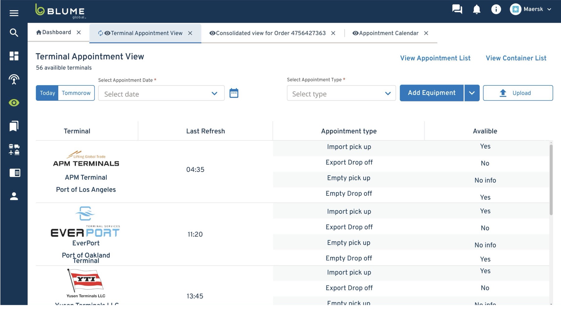
Where the data goes
For office users an appointment is the start of the data, not the end. It streams into finance, manager approvals and escalations, and detention & demurrage, so the components had to account for where the data goes next, not just the booking moment. Aligning that was a dedicated workshop with the two dev teams (front end, and information architecture) before rollout.
The template payoff
ICTSI represented close to the maximum of possible constraints and filter-driven complexity, so the system doubles as a template — subsequent terminals are largely lighter configurations of a problem already solved.