Composable widgets and React page templates that shipped and lasted.
The architecture
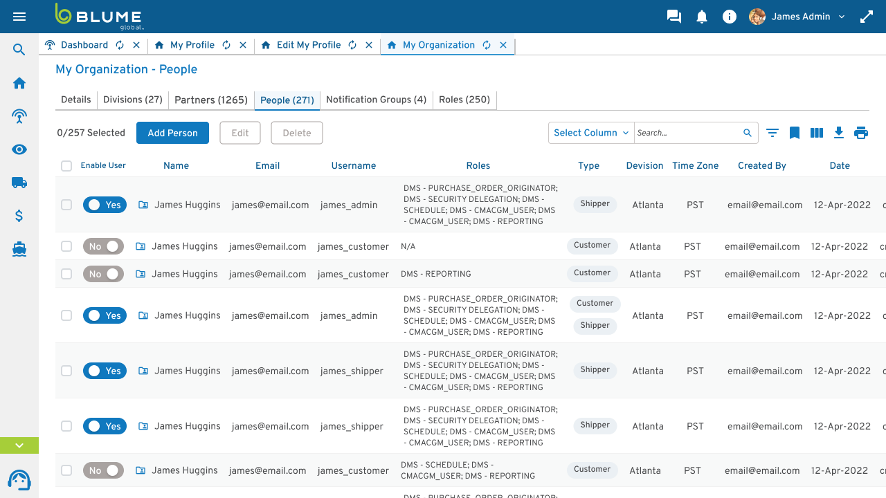
Three levels (org, division, individual), each carrying its own permissions, so a company's internal structure survives the trip into the system. Org setup and user management are where the scaling design system earned its keep, and this is the part that shipped and lasted.
Why composable widgets
The self-service dashboard (pick your widgets from a gallery) only worked because those widgets were real composable components off the shared system, not per-page one-offs. The same components power the admin tables, the notification groups, and the role management screens.
The messy prerequisite
When I arrived there were no rules for when to use a primary vs. secondary button; it was left to each engineer. The first fix was sitting down with engineering to roll out page templates in React (navs, headers, button stacks), turning a pile of legacy disconnect and cross-product drift into one coherent system.
The outcome
The architecture held in production: about 5,000 new orgs self-onboarded in under a week once the system was live, replacing a support-driven process that averaged 100 orgs per agent per week.