When one user is two people — designing a production OS 0→1.
Onboarding — two personas
The platform was built as if it served two clean, separate people: producers who manage projects, upload callsheets, and coordinate crew — and crew members who receive invites, confirm availability, and show up on set. Two roles, two dashboards, two mental models. Except in film and TV, people don't stay in their lane: a gaffer produces a short on the weekend; a coordinator hires their own crew; someone who's been crew for ten years starts directing. The real persona insight is that one user is often both, and the onboarding — and everything after it — has to stop pretending otherwise.
Dashboard architecture ↔ user types
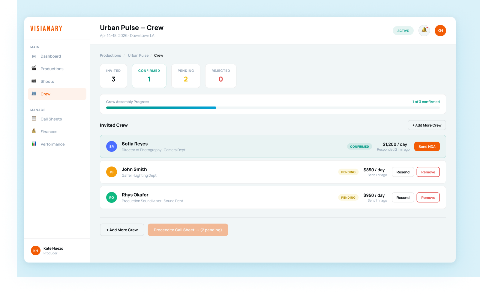
Two concrete diagnoses drove the architecture. First, the crew profile: the existing structure assumed everyone had a visual portfolio, but a PA, a grip, a best boy don't produce a visual artifact — they have a career. So I replaced the portfolio paradigm with something closer to a filmography: credits instead of uploads, verification instead of showcase, role-specific context instead of a blank canvas that quietly said you don't belong here. Second, the navigation that exposed the whole assumption — the crew profile had a top nav (Gigs, Messages, Payout) and a bottom nav with the exact same links. That redundancy was a structural tell. I replaced it with a single, persistent "Switch to managing" pill — findable enough for the dual-role user, quiet enough that crew-only users never notice it. It gives each mode its own ground to stand on while making the seam between them explicit: I see that you're two things, and switching should feel natural.
Design system — branding-driven, data-powered components
A design system built branding-first and driven by data-powered components — each surface (crew profile, producer dashboard) composed from the same component vocabulary so the two modes feel like one product with two rooms, not two apps. I'm keeping the component-and-token specifics light here on purpose: this is live, in-progress 0→1 work, and I'd rather show the real system once there are real screens to point at than describe it at a level I can't yet stand behind.
The MVP that shipped
The MVP is real, not a deck: a workflow-powered dashboard across desktop and a full iOS mobile flow, the onboarding path, and a branded design system — light and dark, its own component vocabulary — built so engineering could pick it up and build straight from it. What reads as "in progress" above is the thinking about the dual-role edges; the shipped surfaces themselves are high-fidelity and system-backed.
Field notes
On what's still open
This is honestly unfinished, and that's the interesting part. The switching mechanism could be a persistent mode toggle rather than a nav button; the two contexts could share some data (your own profile, your connections) while keeping the task surfaces separate; and there are open questions about mobile vs. desktop, and whether producers-who-are-also-crew should onboard differently from crew-who-become-producers. The principle I'm holding: don't design around the idealized user — design for the person who has grown beyond the role you originally imagined for them. That's usually who your most engaged users turn out to be. Because this is still in progress, I'm holding those as open design questions rather than settled answers — which is honestly the truest way to show it.