Reframing payment as the marker of a correctly-scheduled load.
Overview
Blume brought me in to design a payment system for ocean-terminal appointments. Discovery showed the real product was the appointment itself, so I reframed payment as the confirmation that a load had been correctly classified and scheduled. The platform was built for two very different hands, dray drivers on mobile and dispatchers on desktop, and launched with ICTSI as the lead customer (Blume's launch announcement), the world's largest independent terminal operator. It is, to my knowledge, one of the most-used, least-changed products Blume shipped.
The problem
The ask was a payment button. But the terminal had no real appointment mechanism, and no way to categorize dray and trucking services so each could carry the right payment type. Dispatchers were booking multiple containers across terminals with minimal margin for error, while payments were often handled separately through third-party agreements. Speed and accuracy in booking, not billing, was the real pain.
Concept and validation
We ran co-creation and redlining workshops with dispatchers, truckers, and stakeholders, walking real scenarios to find where people actually lost time: searching for container info, reconciling terminal rules, drowning in alerts. Two truths shaped the concept. First, a technology spectrum, not a user type: dray companies ranged from IoT-equipped fleets to mom-and-pop operations still on paper, so the system had to be expressive enough for enterprise and simple enough for a small operator. Second, the dispatcher at the center, split between individual bookings (hazmat, reefers, loads that need care) and enterprise dispatchers who live in bulk operations.
Wireframe testing
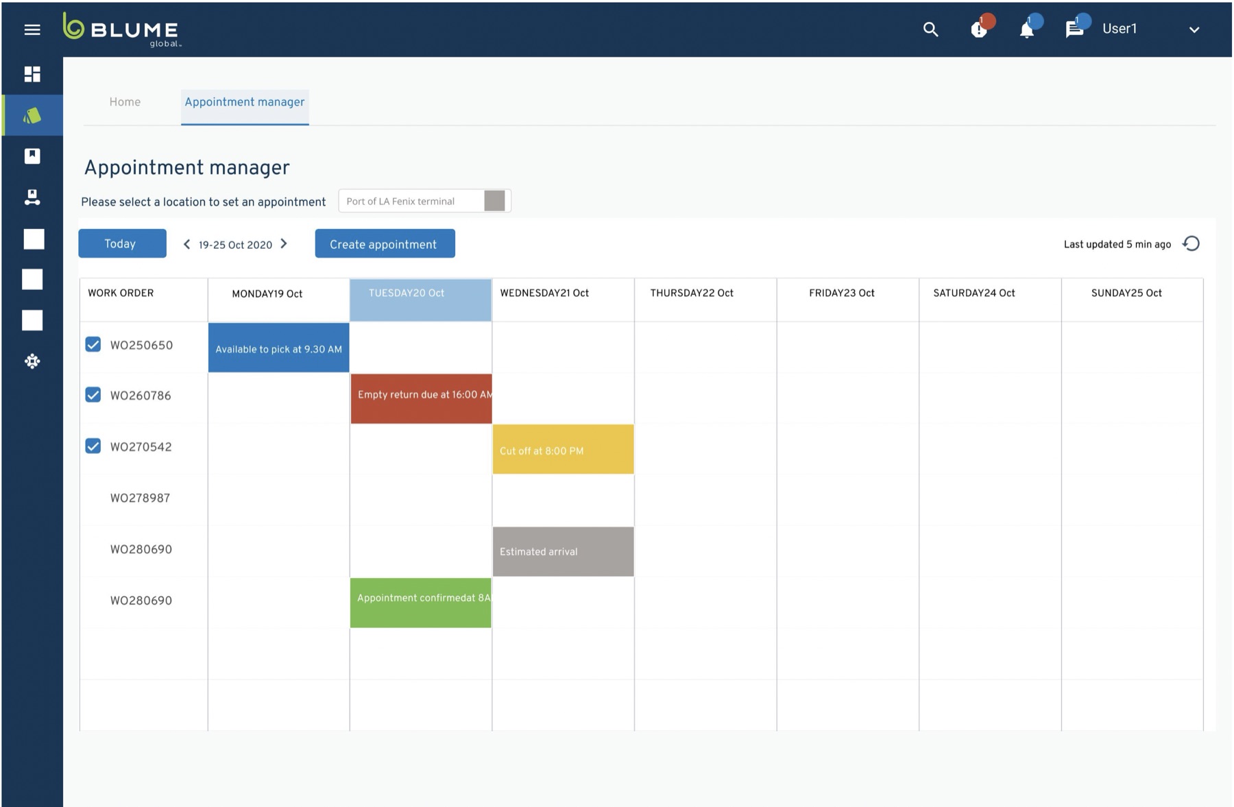
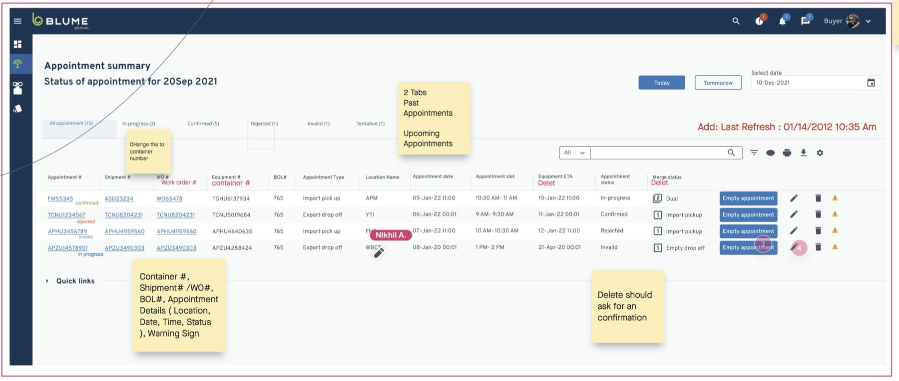
The main discovery came out of testing: neither the container-driven nor the payment-driven model matched how dispatchers think. The calendar was the way to go. A week view with work orders as color-coded states (available to pick, cut-off, confirmed) turned the system from a data repository into scheduling intelligence, and the kind of load became the organizing principle for how a booking gets set up. I also resisted the pull to over-serve the trucker: where office users wanted personalization, a trucker needed one output, a system-generated PDF of appointment details emailed in seconds.
Handoff to development
I ran a workshop with two dev teams, one owning the front end and one owning the information architecture of screens and user flows, so the data architecture was aligned with the design before anything shipped. Designing in the components with engineering meant one system that flexes instead of two that drift apart.
Rolling out with ICTSI
I sat in on client meetings through the rollout, gathering feedback for improvements and the list of next steps. Because ICTSI represented close to the maximum of constraints and filter-driven complexity, the system doubles as a template: subsequent terminals are largely lighter configurations of a problem already solved.
What I'd do differently
I'd insist on showing lo-fi prototypes to management, the C-suite, and a trusted client rep early, to solidify the vision before high fidelity. Alignment across time zones between the US and Asia took quite a while, and I truly believe a few design-driven workshops would have sped it up. Even with that, I'm happy I was able to advocate for the needs of users and prioritize their workflows — that's what made it stick.