Where is my cargo, and what's about to go wrong?
The visibility umbrella: detention & demurrage, exception management, and predictive inland flow, answering "where is my cargo, and what's about to go wrong?" On the ocean side this was a product used by major carriers, CMA CGM and Kuehne+Nagel among them. The highlight within it is the Port of Oakland dashboard, a motor-carrier dispatcher's analytics view built as a Blume × Looker hybrid: Total / Dray / Ocean cuts, KPI tiles, and maps.
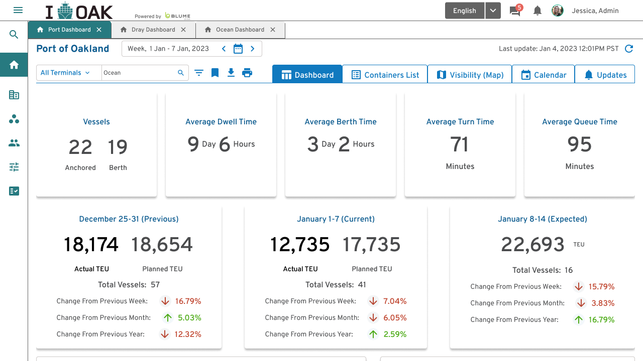
The design question was what a dispatcher needs at a glance versus what a port admin needs to drill into, so the dashboard leads with the handful of numbers that decide a morning (vessels anchored vs. at berth, dwell time, turn time, queue time) and lets everything else live one level down. Designed for desktop, but always with an eye on where it would actually be seen: decision makers and the C-suite checking in on tablets, or the dashboard streaming live on a TV in the office, so everything had to scale. We got to test that for real when a ship got stuck in the Suez Canal in 2021: a live, world-scale exception, streamed on our office screen as it unfolded.
Worth being precise about one thing: the Oakland skin was a prototype we didn't end up shipping. I used the Port of Oakland framing deliberately, as a safe stand-in so the design work could be shown without exposing real client data.