Case Study: CRAFT GUILD AI
Building emotional intelligence into trade education with AI.
How I helped Craft Guild AI transform a powerful idea into a human-centered, scalable mentorship experience — balancing AI capability with the emotions of learning and teaching.
Executive Summary
Craft Guild AI set out to redefine trade education through mentorship powered by artificial intelligence — but before building the technology, the team needed clarity on how the product should feel and function for real users.
KH Creative was brought in to ground the vision in user reality: to identify emotional pain points, validate assumptions, and design a UX foundation that would transform a technical concept into a usable, trustworthy product.
Through stakeholder workshops, user interviews, and emotional journey mapping, we uncovered critical insights:
AI alone wasn’t a selling point — users needed to see tangible value first.
Mentors required financial motivation to engage and stay active.
Apprentices craved real-world simulation and communication practice, not abstract automation.
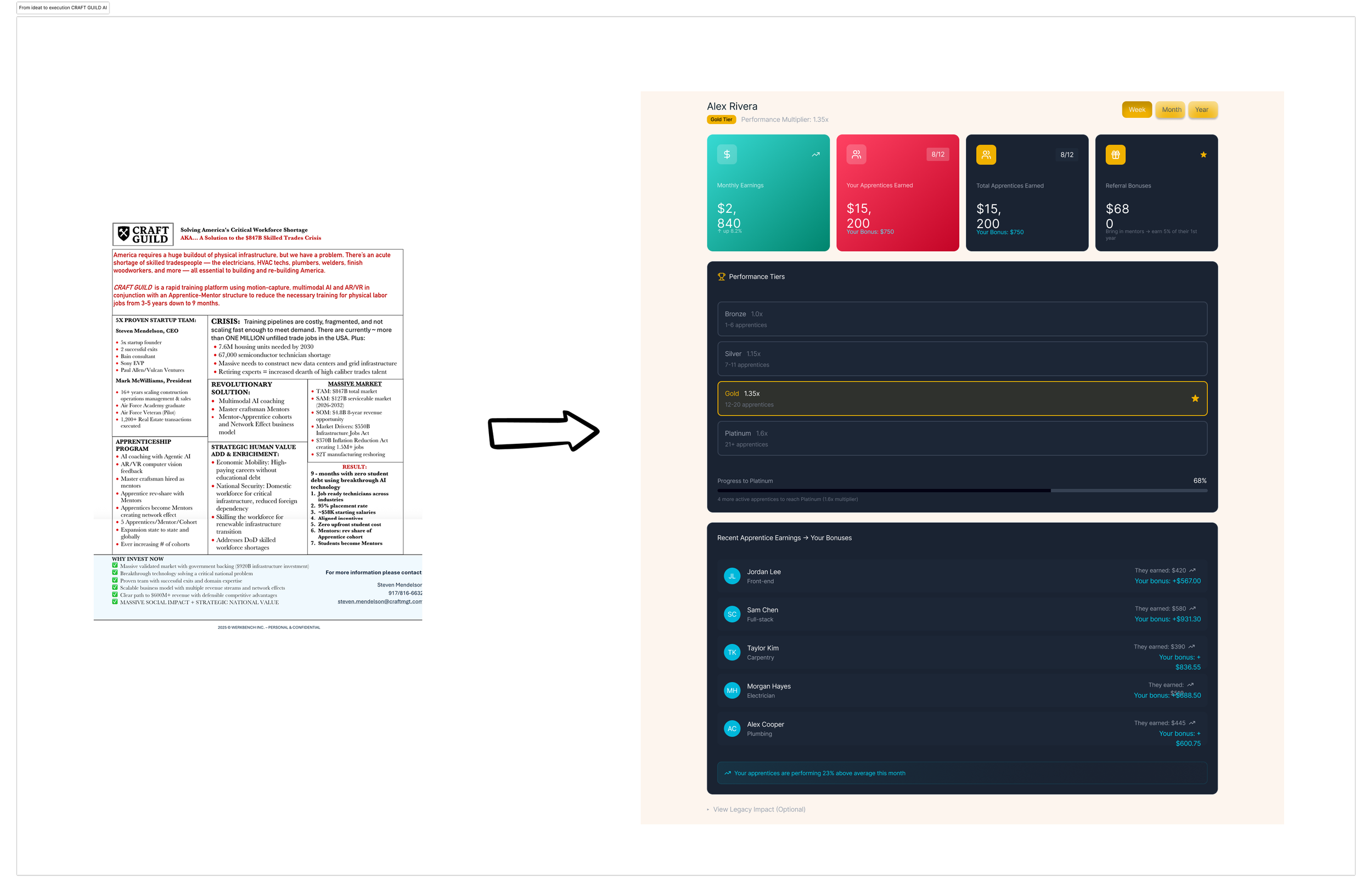
These discoveries evolved into a clear experience strategy: build trust through simplicity, engagement through progress, and loyalty through tangible reward. The resulting proof-of-concept dashboard and AI-assisted learning environment became the north star for the MVP — clarifying product positioning, accelerating development priorities, and reshaping investor storytelling. What began as an early UX exploration became a strategic playbook for Craft Guild AI’s next stage of growth — a blueprint for designing human connection into the future of AI-driven learning.
Context & Business Objectives
Craft Guild AI is building an AI engine designed to revolutionize trade education through mentorship. At the time of engagement, the team had developed early AI capabilities — including skill-matching and training-feedback models — but lacked the experience layer that would make the product usable, lovable, and scalable.
While the founding team had a promising go-to-market hypothesis and a strong understanding of macro-level opportunity — the skilled trades crisis, government infrastructure investment, and labor shortages — the user-level experience was undefined.
There was no clear UI direction, no structured onboarding flow, and limited understanding of each stakeholder’s pain points (mentors, apprentices, employers, administrators).

Key challenge: The MVP was being shaped primarily by assumptions and market urgency rather than by real user insight. The team needed to pause, reflect, and ground product decisions in human context before scaling technology.
My role was to bridge that gap — translating market need and business ambition into a human-centered UX strategy that could inform interface design, onboarding, and engagement models.
Starting point snapshot:
AI engine: in development
Market validation: strong (government funding, urgent demand)
UX maturity: minimal
Goal: define user journeys, identify pain points, and craft an experience vision aligned with the business roadmap
Discovery
Craft Guild AI’s founding team wanted to better understand how to translate their vision into a usable experience — and potentially expand their offering into a “trades exchange” ecosystem connecting mentors, apprentices, and employers.
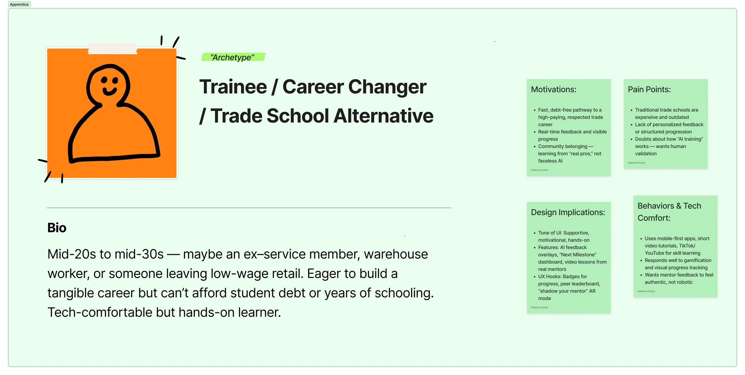
At the time, their concepts of apprentice and mentor user roles were broad, with limited behavioral data. My role was to define these roles in human terms, surface real emotional and motivational patterns, and identify the critical UX opportunities that could make their AI platform both intuitive and trustworthy.
Stakeholder & User Research
I began with stakeholder interviews to uncover business goals and technical constraints, focusing on how to align each user’s value expectations—mentors, apprentices, and the platform itself—without creating friction.
From there, I conducted user research with potential apprentices and mentors, focusing on lived experience:
What motivates someone to teach vs. learn in the trades?
What role does technology play in their daily routine?
What makes them trust (or distrust) AI?
These interviews revealed an emotional gap: both mentors and apprentices wanted validation and visibility, not automation for its own sake.
Personas & Archetypes
Two key archetypes emerged:

Emotional Journey Mapping
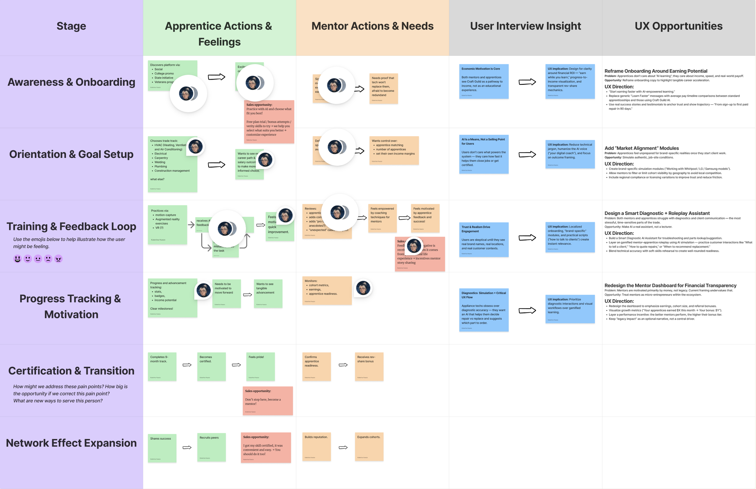
Next, I mapped the emotional journeys of both mentors and apprentices across six stages:
Awareness & Onboarding – discovery and initial excitement
Orientation & Goal Setup – defining trade path and objectives
Training & Feedback Loop – day-to-day practice and coaching
Progress Tracking & Motivation – reinforcement and recognition
Certification & Transition – proof of mastery and career shift
Network Effect Expansion – becoming a mentor / contributing back
By pairing their emotions, actions, and needs side by side, I was able to highlight shared pain points — like the lack of transparent progress metrics and unclear pathways from apprentice to mentor.
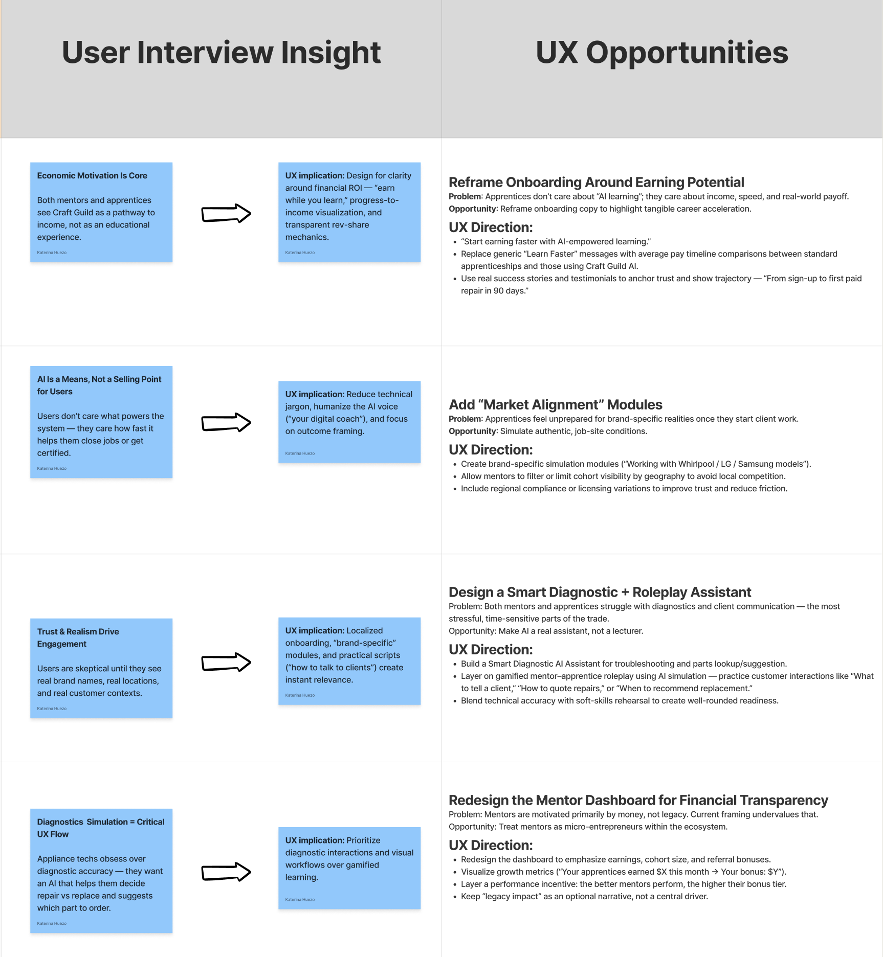
Majority of these points became a direct UX opportunity — from reframing onboarding around earnings potential, to designing smart diagnostics and mentor dashboards focused on financial transparency and trust.
Insight Synthesis
User interviews reframed several early assumptions about how Craft Guild AI’s product should communicate value.
The most surprising discovery was that AI assistance itself was not a selling point for apprentices. They didn’t want an algorithm teaching them — they wanted tools that made learning feel real and practical. This insight shifted the product narrative from “AI-powered training” to “AI-supported mastery,” placing emphasis on tangible outcomes, not technology.
The second major finding was that mentors needed clear financial incentive to participate. While legacy and pride mattered, revenue-sharing and cohort tracking were the real motivators. That understanding directly shaped the mentor dashboard concept — turning mentorship into both a professional and financial growth path.
Third, apprentices consistently expressed the need for real-life simulation and vocabulary practice. They wanted to learn how to speak to clients, identify equipment, and make informed decisions under realistic pressure. This became the foundation for the AI Practice Assistant, designed to train communication, recognition, and contextual skill-building through scenario-based interactions.
These insights led to two immediate design priorities:
A Mentor Dashboard built around performance visibility and income tracking.
An Apprentice Learning Environment modeled on real-world scenarios and language fluency.
Finally, the visual language of the product evolved from these same insights — drawing inspiration from the users’ actual work environment. Electrical wiring diagrams informed iconography; the soft tones of carpentry woods and metals inspired a neutral, tactile palette. Every color and component became an echo of the physical trades — grounding the interface in familiarity and trust.
The core realization: technology alone doesn’t build trust — empathy and tangible progress do.

Experience Strategy
At this stage, the focus shifted from understanding users to defining how the product should feel and behave.
The overarching UX principle was simplicity — putting everything the user might need, worry about, or value right in front of them. No hidden functionality, no excessive layers of navigation. The design had to immediately answer the two unspoken questions both user groups shared:
“How does this help me earn faster?” and “How does this make my day easier?”
To achieve this, information architecture and feature disclosure were built directly around user pain points rather than feature categories. Each screen was designed to reduce cognitive friction and highlight tangible value at a glance.
User engagement became the core strategy for the MVP. The goal wasn’t just usability — it was traction. Every interaction needed to showcase how Craft Guild AI makes users’ professional lives easier and more rewarding.
This focus on engagement also became the filter for the product roadmap: only features that directly reinforced motivation, trust, or earning potential were prioritized for the MVP. Everything else was deliberately deferred to maintain laser focus on traction, adoption, and measurable user value.
The strategy: build trust through simplicity, engagement through visible progress, and loyalty through real-world impact.
The experience was further guided by three design lenses based on Don Norman’s visceral–behavioral–reflective model:
Visceral: Capture attention through a flashy, confidence-building dashboard that makes progress and rewards instantly visible.
Behavioral: Deliver training flows powered by AI, reinforcing mastery and showing clear, incremental value through practice and feedback.
Reflective: Help users connect product outcomes to what matters most — earning more, faster.
For apprentices: cutting educational time and simulating real-world scenarios to build autonomy.
For mentors: turning mentorship into passive income and a recruitment funnel for their own businesses.
Design System & Information Architecture
The system design focused on creating an interface that immediately communicates value — prioritizing clarity, visibility, and tactile familiarity. At its core, the UX principle remained simplicity: make everything the user needs or worries about visible from the first glance. The design needed to be bold and intuitive enough for field use, while sophisticated enough to scale across roles and future features.
Architecture & Layout Logic
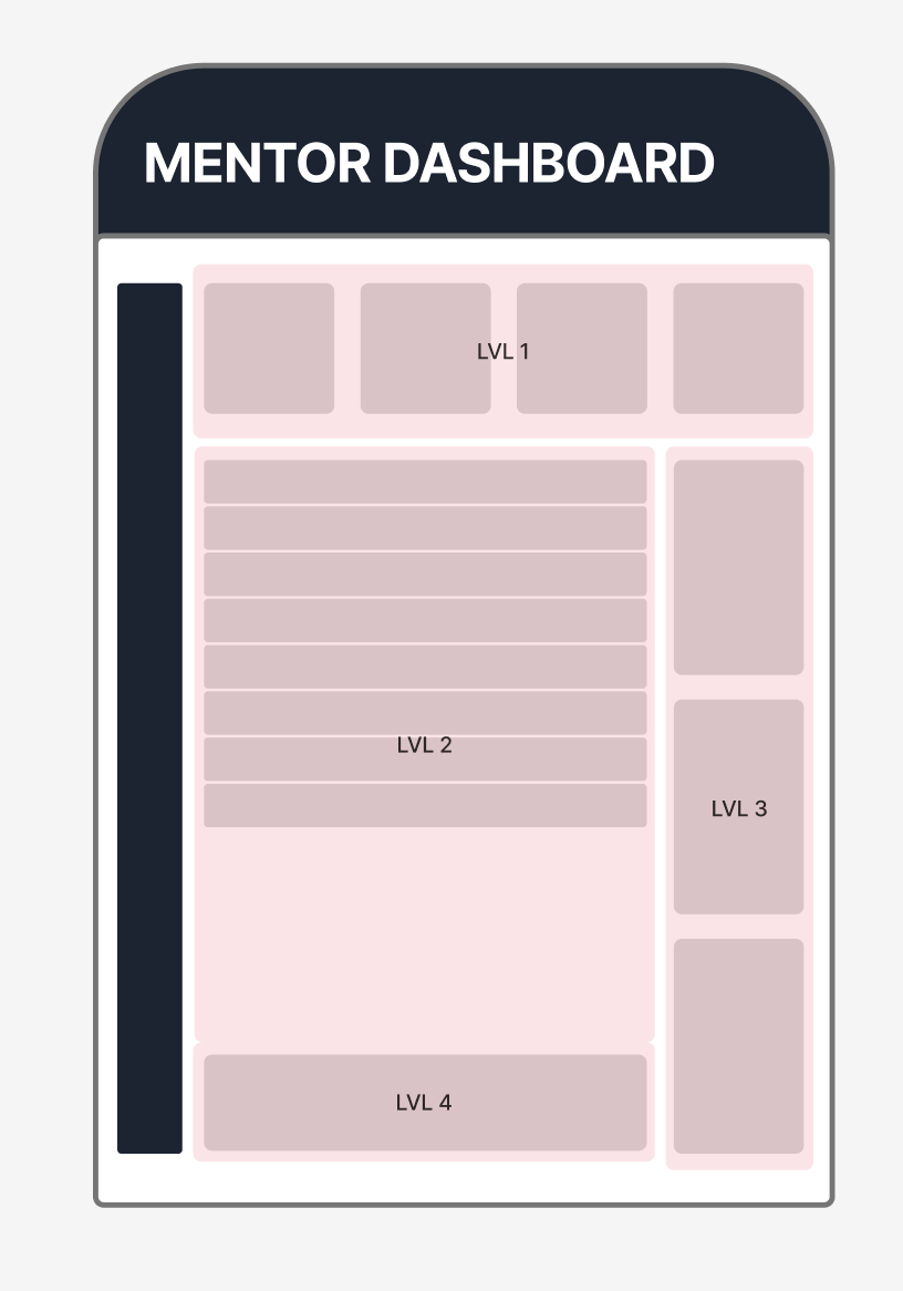
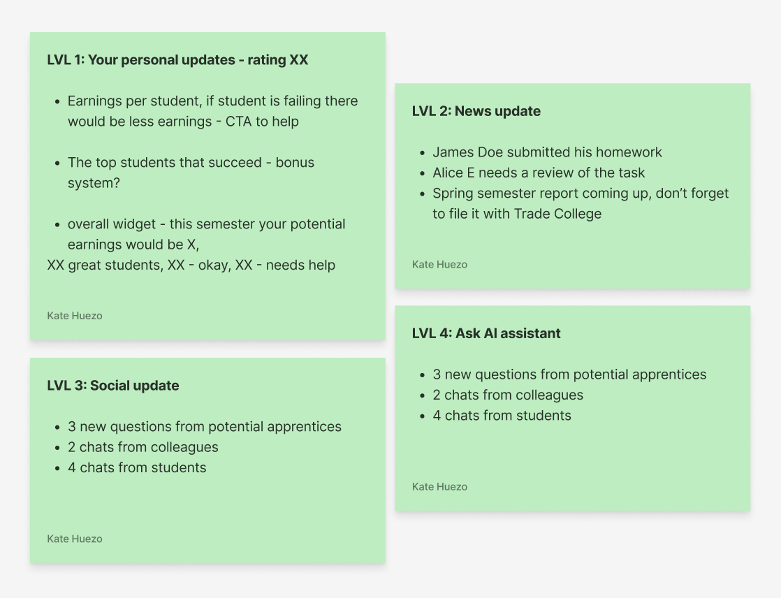
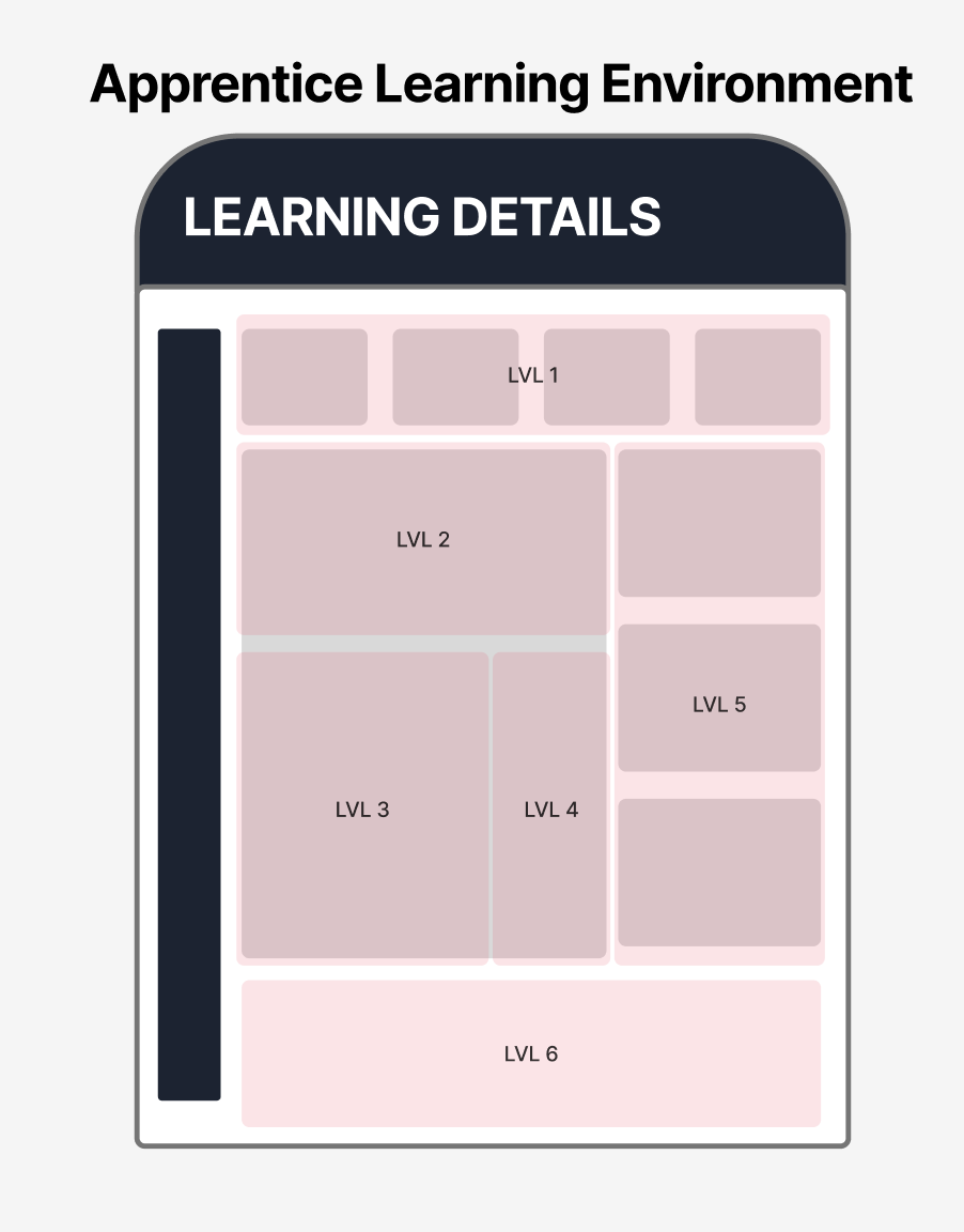
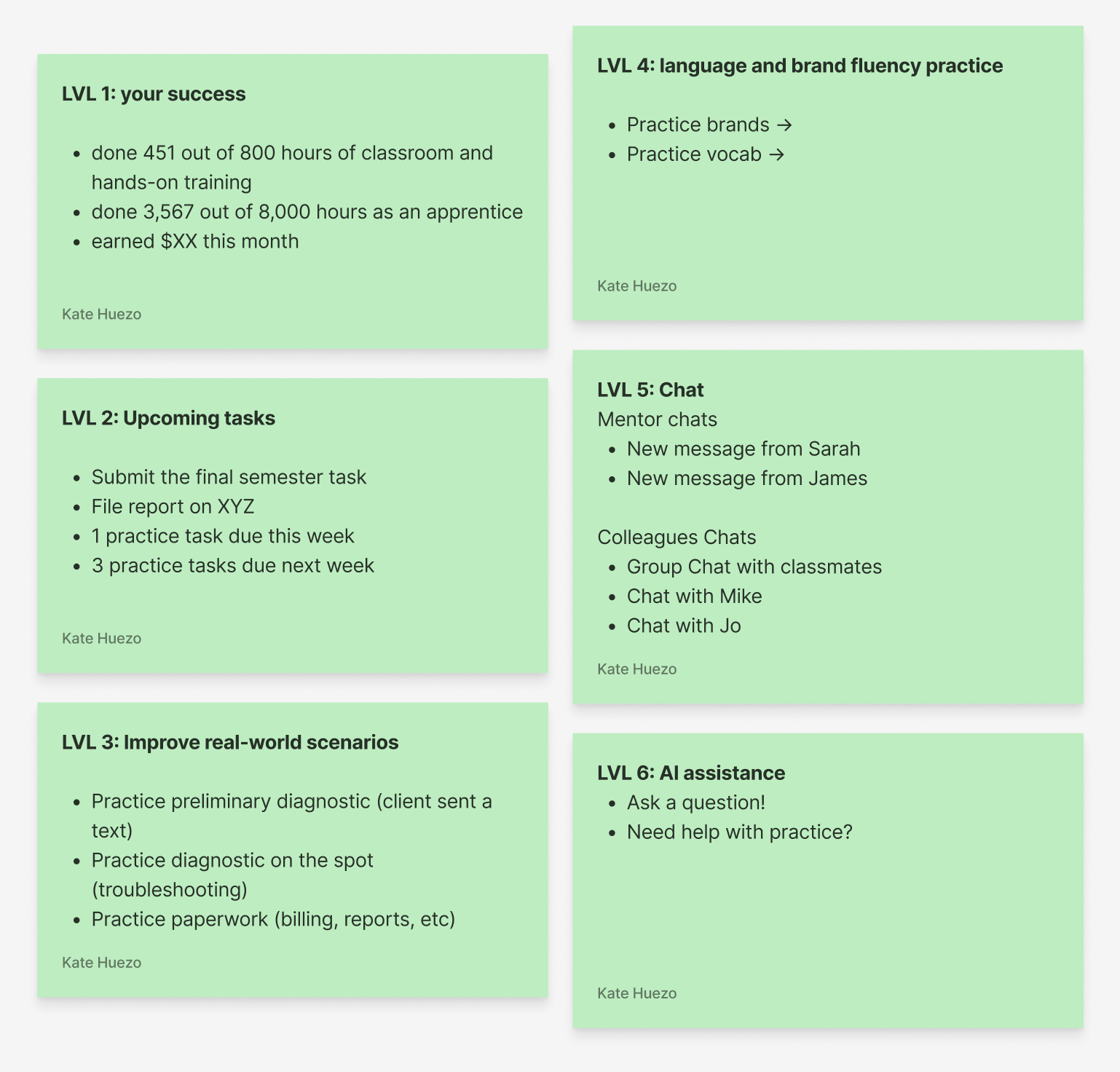
I designed two primary environments — the Mentor Dashboard and the Apprentice Learning Environment — both structured around progressive “levels” of information visibility.
Each level reflected a specific mindset moment: quick updates first, deep insights second, and AI-powered help always within reach.
Mentor Dashboard:
Built to visualize performance and revenue at a glance.
Apprentice Learning Environment:
A mirror ecosystem designed for motivation and skill-building.
Design System & Visual Language
The design system drew visual inspiration from the users’ everyday environment — workshops, wiring diagrams, and material palettes.
Icons: angular and precise, echoing the sharp lines of electrical schematics.
Colors:
Primary accents derived from circuit diagram brights (teal, red, and yellow).
Secondary tones inspired by metallic finishes (gunmetal blue, steel gray).
Backgrounds softened with wood and beige undertones to convey warmth and craft.
Typography & Hierarchy: industrial yet readable — optimized for tablet-first use and legibility under daylight conditions.
Interactive Components: high-contrast buttons, tactile chat modules, and visual progress bars designed for visibility and immediate feedback.
Every component had to feel “touchable” — like a real tool rather than a digital interface.

Scalability & System Logic
The design system was modular and role-agnostic, allowing components like “task cards,” “progress widgets,” and “AI prompts” to be reused across apprentice, mentor, and admin contexts. Responsiveness was built from the start: tablet-first for on-site training, mobile-friendly for quick updates, and desktop for administrative oversight. The AI assistant remained omnipresent across all layouts — always docked at the lower area of the screen — offering continuity between learning, earning, and support.
Outcome
The result was a cohesive, tactile digital environment that feels built for hands-on professionals. Information hierarchy became intuitive, colors grounded the brand in real-world familiarity, and the AI’s presence felt helpful, not intrusive. Together, the system balanced industrial practicality with emotional intelligence — the core of what makes Craft Guild AI’s UX distinct.
Prototyping & Testing
To validate the early UX direction, I created a proof-of-concept prototype, vibe-coded directly from the design system. The goal wasn’t high fidelity — it was to test comprehension and emotional response to the core dashboard layout.
I shared the prototype with an experienced electrician, chosen specifically because he represented the target user mindset: pragmatic, busy, and somewhat skeptical of digital tools. His feedback helped assess whether the interface communicated immediate, tangible value.
The test focused on dashboard comprehension and motivational clarity — could users instantly see what mattered most, and did the experience invite them to act? The results were encouraging: he immediately understood where to check apprentice performance and potential earnings, and — most importantly — expressed curiosity about how AI could further support his work.
That reaction confirmed a key hypothesis: once users see their immediate, practical needs met, they become open and interested in exploring AI-driven features. The product’s positioning worked — the interface built trust first, then curiosity.
Insight validated: Meeting practical value first opens the door for users to embrace innovation later.
Outcome & Impact
The collaboration resulted in a complete strategic proof of concept — a document and prototype that now serve as the foundation for Craft Guild AI’s investor presentations and MVP development. Deliverables included several validated wireframes, a Figma file with defined system logic, and a draft UX/development roadmap ready to activate once funding milestones are met.
The impact was immediate. The work clarified product positioning, sharpened the investor narrative, and reframed how the founders viewed their own solution — not as a technical AI platform, but as a human-centered learning ecosystem. It also helped the team identify a clear MVP scope, accelerating development priorities and aligning business, design, and engineering around a shared north star.
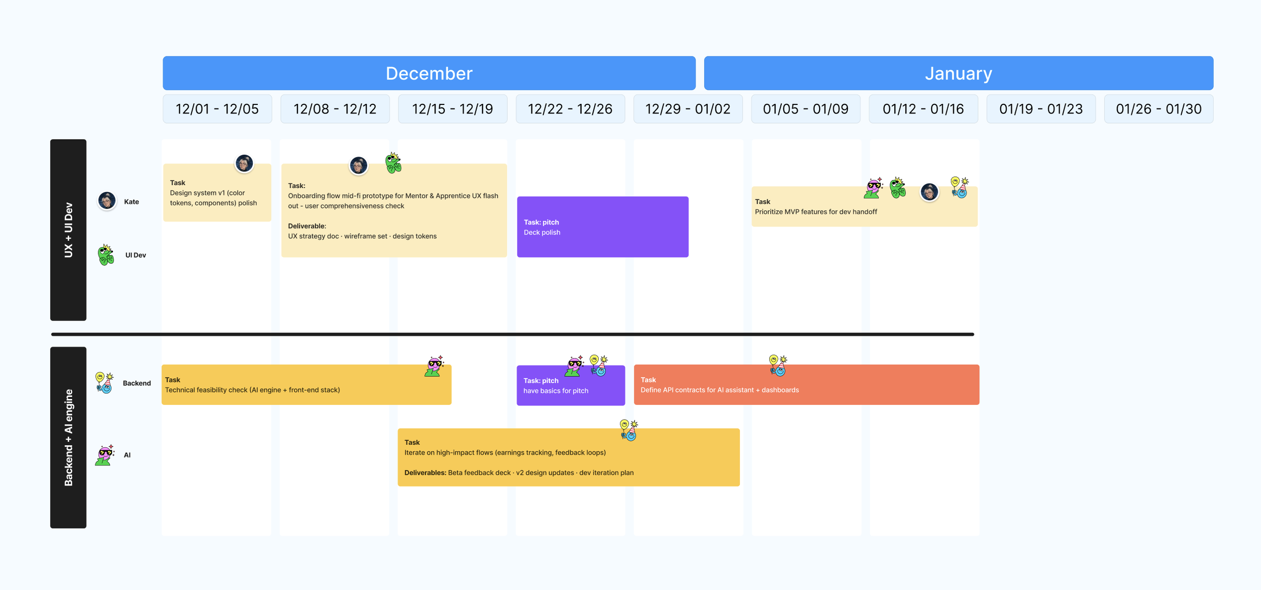
On a narrative level, the project reshaped the team’s perception of UX itself. What began as a request for interface help evolved into an understanding that UX is the strategic foundation — the connective tissue between technology, emotion, and market traction. The founders expressed renewed confidence in how their product speaks to users and investors alike, and have since incorporated this UX vision into their upcoming funding materials. The project became more than a design engagement — it became a roadmap for growth.
As Craft Guild AI enters its next funding phase, our collaboration remains ongoing, with plans to expand the prototype into a fully realized product experience post-investment.
Reflection
This project reaffirmed one of my core beliefs as a designer: simplicity is not minimalism — it’s clarity. By focusing on what users actually value, rather than what the technology can do, we built trust first — and curiosity followed naturally.
What worked particularly well was grounding every design decision in user emotion and environment. Translating the physical textures of the trades — metal, wood, and wiring — into digital interactions made the product instantly relatable and credible. The main challenge was aligning visionary stakeholders with practical user realities, ensuring that ambition didn’t outpace comprehension.
This work reshaped my approach to early-stage UX strategy. I saw firsthand that founders don’t just need design; they need translation between technology, business, and human behavior. Once they understand how UX frames both investor and user narratives, it becomes a strategic driver, not a finishing layer.

Looking ahead, I’d love to continue collaborating with Craft Guild AI. I’m a strong believer in the transformative potential of AI-driven education, especially when paired with VR learning environments. Designing immersive, practice-based training flows for trades — where users can safely learn by doing — is the next frontier I’m eager to explore. Craft Guild AI reminded me that good design doesn’t just make products easier to use — it makes people more willing to believe in what’s possible.