eCommerce UX:
Driving measurable improvements in conversion, fulfillment clarity, and system usability.
I’ve worked across the full lifecycle of ecommerce experiences — from The RealReal luxury discovery and high-value purchase decisions to the CargoWise Warehousing operational systems that power inventory accuracy, fulfillment, and scale.
My background spans consumer-facing ecommerce, enterprise warehouse platforms, and deep UX auditing, giving me a rare end-to-end view of how commerce actually works.

Commerce Was My Entry Point Into Design
Long before I held a UX title, I was already designing for commerce.
As a Graphic Designer at Wortmann Holding on the Tamaris shoes brand, I worked closely with retail and wholesale-facing materials and regularly attended wholesale trade shows, where buyers placed orders for upcoming seasons. I saw firsthand how individual stores and international chains made purchasing decisions — what they cared about, what built confidence, and what caused hesitation.
That experience gave me an intuitive understanding of what commerce really is: designing systems that support selling physical products at scale, balancing brand, inventory realities, and buyer psychology.
When I later moved into UX and eCommerce platforms, that foundation became a differentiator. I don’t design in a vacuum — I design with sales, inventory, and operational truth in mind.


The Consumer Truth
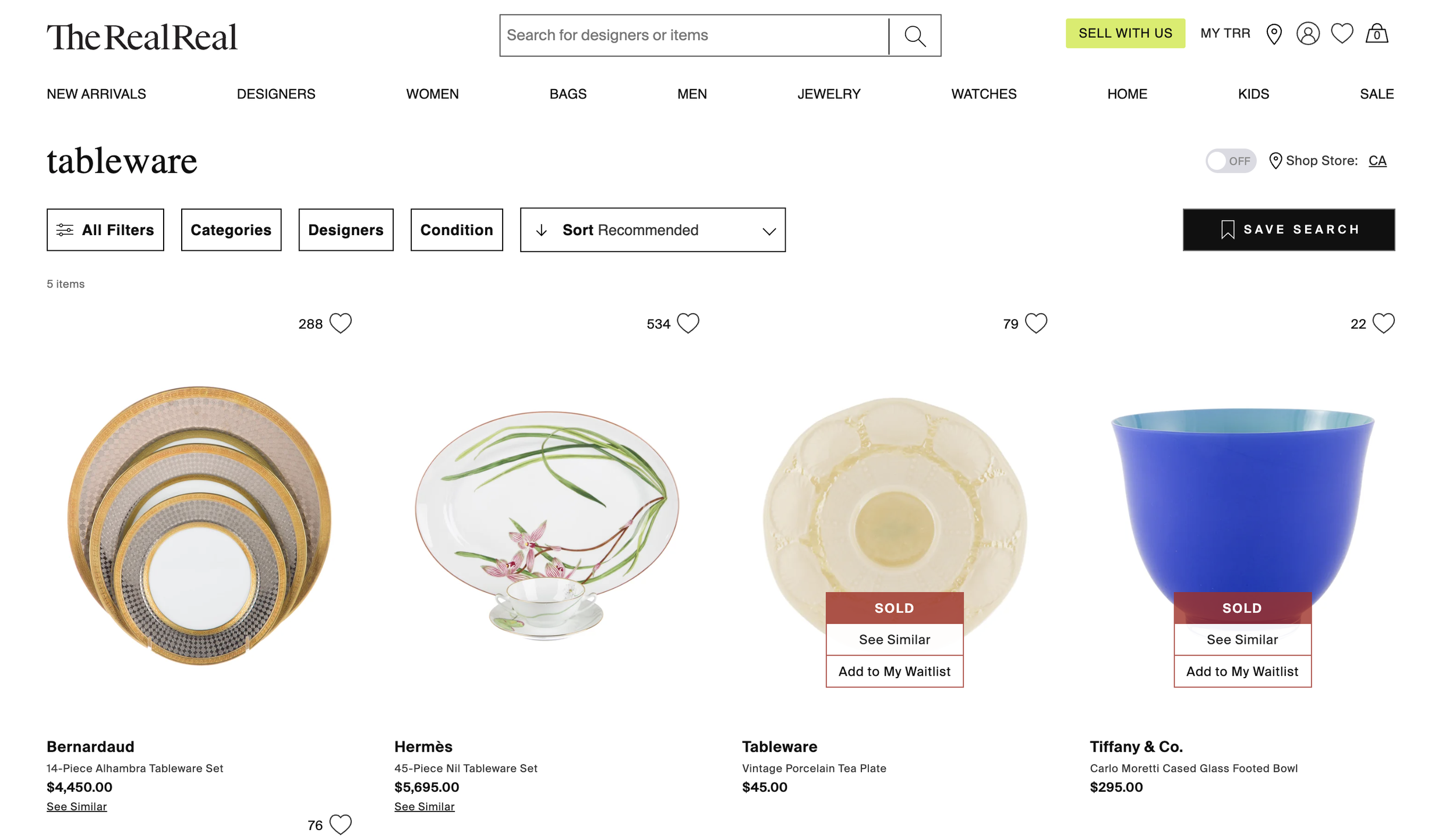
I’ve learned to watch closely for manual workarounds — they’re one of the clearest signals of a UX gap. At The RealReal, we noticed a recurring behavior: users were adding items to cart not because they intended to purchase, but because they wanted to remember them. Cart had quietly become a bookmarking tool.
That behavior made it obvious we were missing a core affordance. Introducing wishlist and favorites didn’t just clean up cart UX — it unlocked better analytics, improved recommendation quality, and ultimately contributed to a 13% lift in purchases. Fixing the UX removed friction not just for users, but for the entire system downstream.
I’ve also seen firsthand how poor product positioning can quietly create inventory and fulfillment problems. In the Home category at The RealReal, we once faced a situation where the warehouse was overflowing with specific inventory — yet customers barely interacted with it. The issue wasn’t supply; it was visibility and curiosity. The products technically existed on the site, but nothing about their presentation invited engagement.
Through collaborative experimentation — adjusting copy, restructuring PDPs, and rethinking image hierarchy — we reframed how that inventory was surfaced. Once the story made sense to users, interest followed.
The System Truth
After years working in logistics platforms and conducting deep audits of internal systems — especially at Blume Global, where I helped reduce over 500 pages down to 379 core experiences — I’ve developed a strong empathy for Customer Experience teams.
I understand how operations work and where constraints come from. But I’ve also seen how often customer support ends up absorbing the cost of unclear navigation, buried information, or ambiguous system states. Thoughtful information hierarchy, clearer wayfinding, and putting the right data in front of users at the right moment resolves a surprising number of issues before they ever reach CX. That’s where design has real leverage.

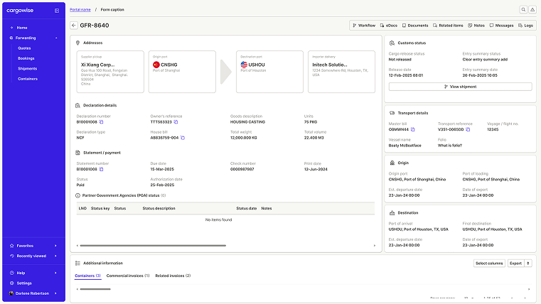
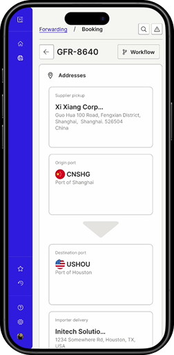
The Operational Truth
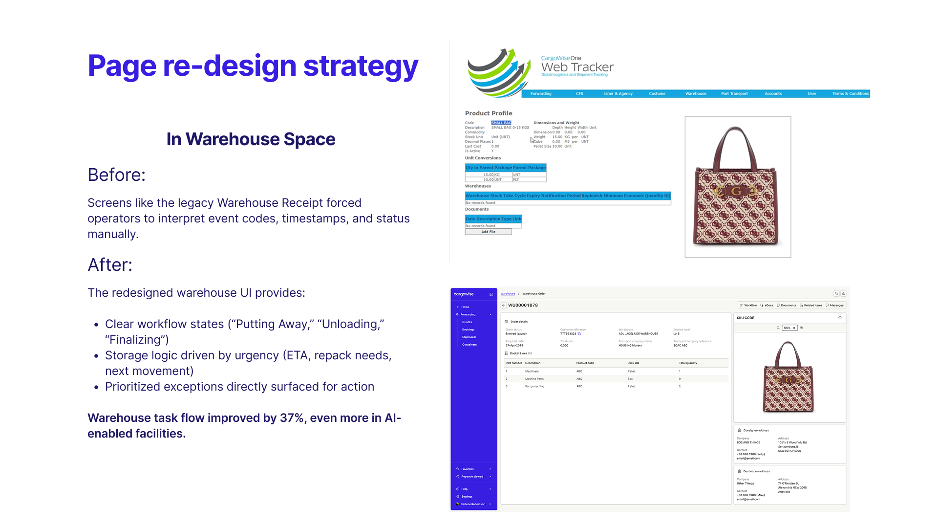
Working on warehouse and inventory platforms at WiseTech Global, within the Neo ecosystem, taught me how quickly small UX ambiguities turn into real operational cost.
In warehouse systems, inventory isn’t abstract. It’s physical, time-bound, and unforgiving.
When status, ownership, or next actions aren’t immediately legible, errors don’t announce themselves — they accumulate.
This is where progressive disclosure becomes an operational tool, not a design preference.
Each screen has a job. Each role needs a predictable structure. And that structure must repeat, so users can orient instantly without re-learning the system.
When information is revealed in the right order — and only when it’s needed — critical signals surface, exceptions stand out, and cognitive load drops. Engineers stop debating layouts and start sharing logic.
At scale, eCommerce UX doesn’t break on the product page. It breaks where inventory, status, and system truth fall out of alignment. Operational systems fail when they show too much, too early, or hide what matters.
Clarity here prevents manual workarounds, reduces escalation, and protects every downstream promise — including the customer experience.