When one user is two people: thinking through dual-role UX
There's a specific kind of design problem that doesn't announce itself loudly. You're not dealing with a broken flow or a confusing label. You're dealing with a false assumption baked so deep into the product structure that it shapes everything downstream — and nobody noticed because it mostly works. Until it doesn't.
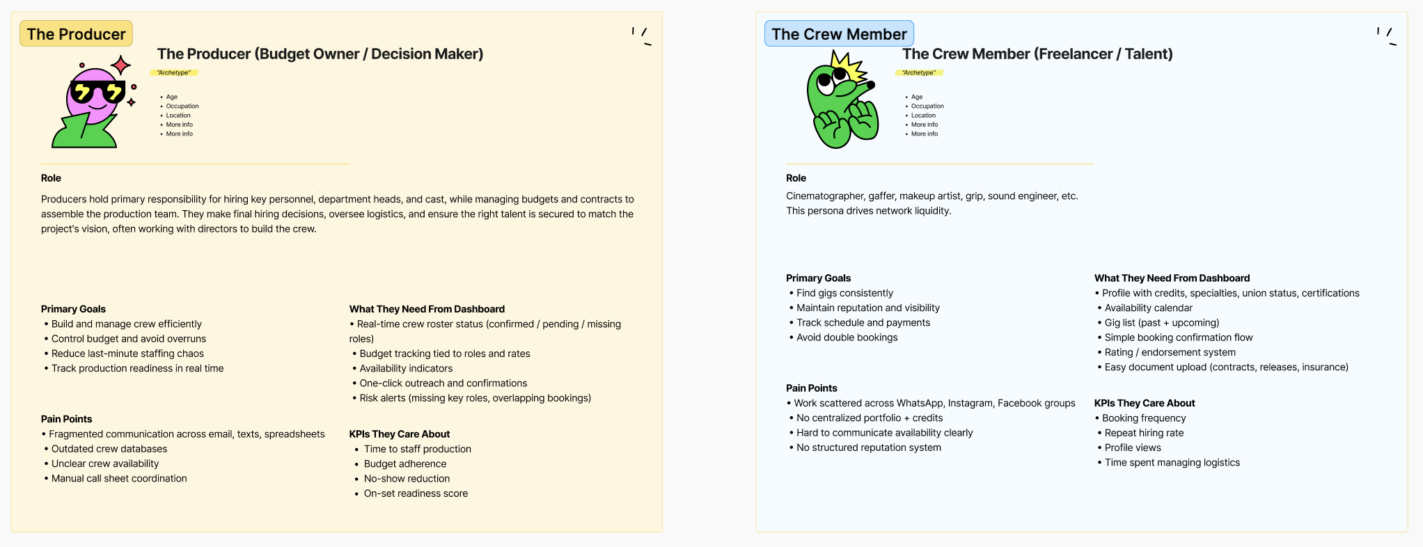
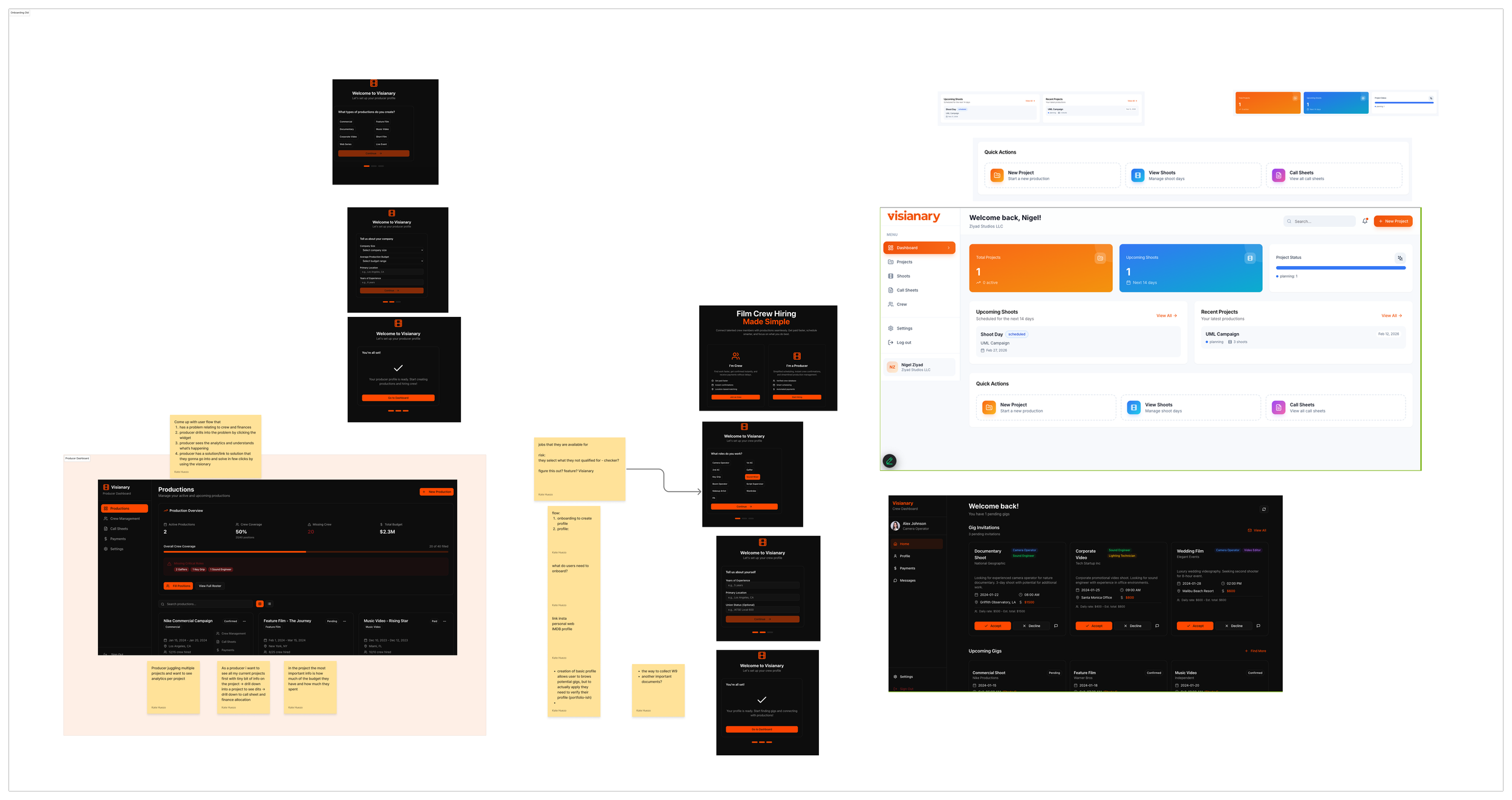
I ran into one of those while working on Visianary, a production OS for film and TV that connects crew members with productions. The platform serves two distinct user types: producers, who manage projects, upload callsheets, and coordinate crew — and crew members, who receive invites, confirm availability, and show up on set.
Clean enough on paper. Two roles, two dashboards, two experiences.
Except in film and TV, people don't stay in their lane like that.
The person who is both
A lot of people working in film and TV wear multiple hats — often simultaneously. A gaffer on one project might be producing a short on the weekend. A production coordinator might be hiring their own crew for a small commercial. Someone who's been crew for ten years eventually starts directing, starts producing, starts managing the people they used to stand next to.
The platform I was working on was built as if these were two completely different people. Two separate modes. Two separate mental models. No graceful way to move between them.
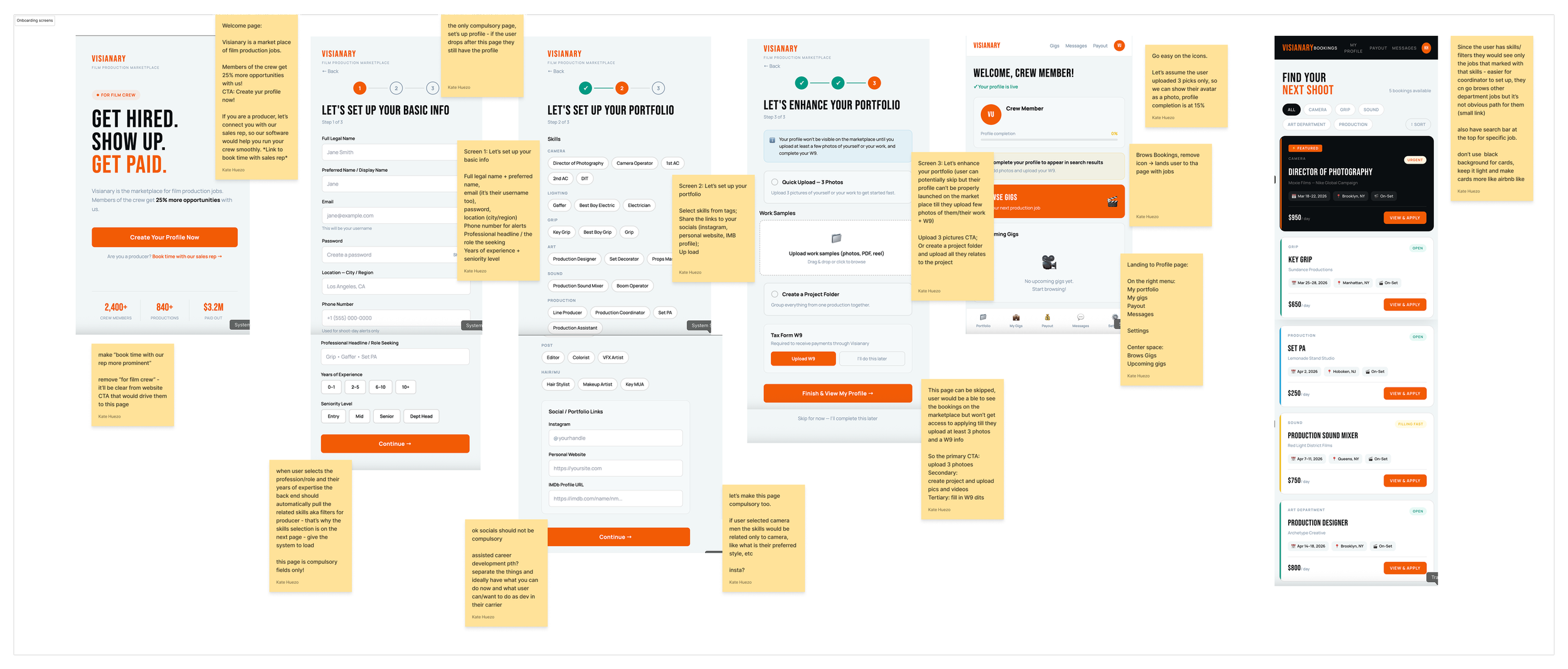
The first sign that something was off came when I was designing the crew member profile page. The existing structure assumed every user would have a visual portfolio — the kind a cinematographer or director builds up over years. But most crew roles don't produce a visual artifact. A PA doesn't have a portfolio. Neither does a grip, or a best boy, or someone running a lighting rig. What they have is a career — productions they've worked, roles they've held, people they've worked alongside.
So I replaced the portfolio paradigm with something closer to a filmography. Credits instead of uploads. Verification instead of showcase. Role-specific context instead of a blank canvas that silently suggested: you don't belong here.
That was one problem. But the dual-role tension was lurking underneath it.
The nav that exposed the assumption
When I built the first mockup, the crew profile had a top navigation bar with links to Gigs, Messages, and Payout. There was also a bottom navigation bar with — Gigs, Messages, and Payout.
That's not a UX mistake, exactly. It's a structural one. The top nav was trying to be two things at once: a way to get around the app, and a way to signal that the app knew who you were. It failed at both.
The fix made the assumption explicit: if someone using the platform is also a producer, they need a clear, low-friction way to step out of their crew context and into their management context. Not a separate login. Not a buried settings toggle. Something in the interface itself that says — I see that you're two things, and switching between them should feel natural.
I replaced the redundant nav links with a single "Switch to managing" pill button. Persistent enough to be findable. Subtle enough not to distract crew-only users who'd never need it.
That one change required naming something the product had been quietly avoiding: a user isn't always one thing, and the interface shouldn't pretend otherwise.
What I was really working through
Dual-role UX is easy to underestimate because it feels like a technical problem — permissions, contexts, session states. But the harder design question is a human one: how does this person understand themselves in relation to this product?
When you're a crew member getting an invite to a shoot, you're thinking about your call time and your day rate. When you're producing, you're thinking about who confirmed, who's still pending, whether the callsheet went out. Those are genuinely different cognitive states, and forcing someone to navigate both from the same interface, with no clear seam between them, creates friction that's hard to name but easy to feel.
The design I landed on gives each mode its own ground to stand on — a crew profile built around credits and availability, a producer dashboard built around project management and crew coordination — while making the path between them explicit and intentional.
It's not finished. The switching mechanism could be a persistent mode toggle rather than a navigation button. The two contexts could share certain data — your own profile, your connections — while keeping the primary task surfaces completely separate. There are open questions about how the experience should feel on mobile versus desktop, whether producers who are also crew should onboard differently from crew who become producers later.
But the principle feels right: don't design around the idealized user. Design for the person who has grown beyond the role you originally imagined for them.
That's usually who your most engaged users turn out to be, anyway.