Claude vs V0: Testing AI Vibe Coding for Shroomify
AI design tools are evolving fast, and I’ve been curious about how far they can really go when it comes to building actual user experiences. At KH Creative, I don’t just chase shiny tools—I stress-test them to see where they add value, where they break, and what this means for the future of design.
Recently, I ran two rounds of experiments with Claude and V0 using my mushroom-growing side project, Shroomify, as the test case. Here’s what happened.
Round One: The Blank Canvas Test
I decided to keep prompt as vague as possible and very openended embracing a YOLO style vibe coding.
Prompt:
”Hi! I have an app idea, it’s a guide to grow mushrooms. Could you help me code it?”

Claude’s Output:
Interaction with the agent:
Asked clarifying questions before building (very “eager helper” energy). After that put together a plan of action, outlined of what it about to code and held space for “go ahead” command. This felt like more intelligent and interactive behavior, which is a plus if you a beginner vibe coder.
Outcome design:
Produced code with vibrant color schemes, and used emojis as image or graphic substitute - a nice touch. Every clickable element had hover states. Well structured info blocks - which is expected from the “app” even if it’s browser based - users want that interactivity, a journey.

V0’s Output:
Interaction with the agent:
Jumped right into building, which is cool but the indicator of thinking was really small so for a moment there i was wondering if anything is happening at all. Felt a bit flat at first.
Outcome design:
Simpler visuals, hover states on cards are not consistent.
Richer content blocks—more information density, it gives more “website” not “app”.
Takeaway:
Claude = engagement + interaction.
V0 = content + structure.
Round Two: SaaS & Design Specks Test
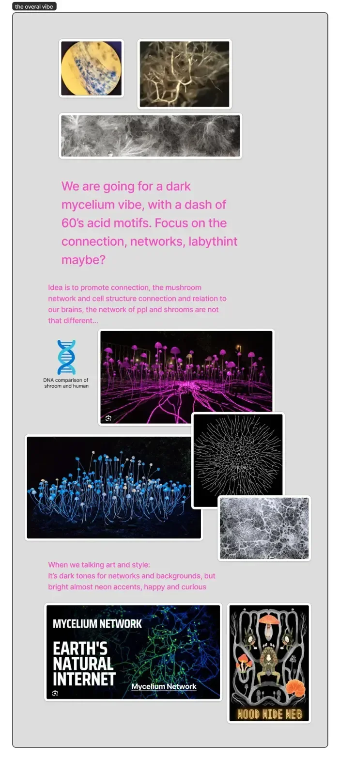
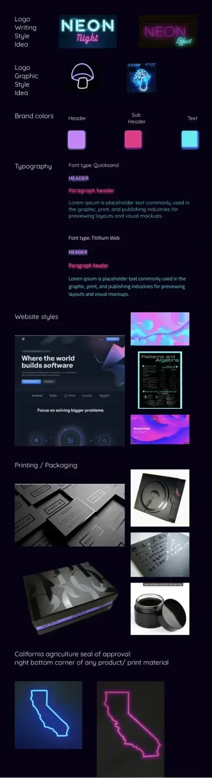
This time I didn’t want to just throw prompts into the void—I wanted to see how these tools would handle something closer to real-world SaaS design requirements. As a true SaaS girlie, I couldn’t help but reframe Shroomify as a full service: not only a place to buy spores and learn how to grow, but also a platform offering equipment bundles, AI-powered grow analysis, and a community for mushroom enthusiasts to connect.
So instead of a vague “make me a page,” I gave both tools what an actual design team would expect: branding and aesthetic direction, app architecture, a user flow, and lo-fi Figma screens. This setup left room for a bit of “yolo coding” (where the AI could invent components if needed) but grounded the experiment in a solid foundation—exactly the kind of brief that should separate a hallucinated UI from a real, usable design.
Prompt:
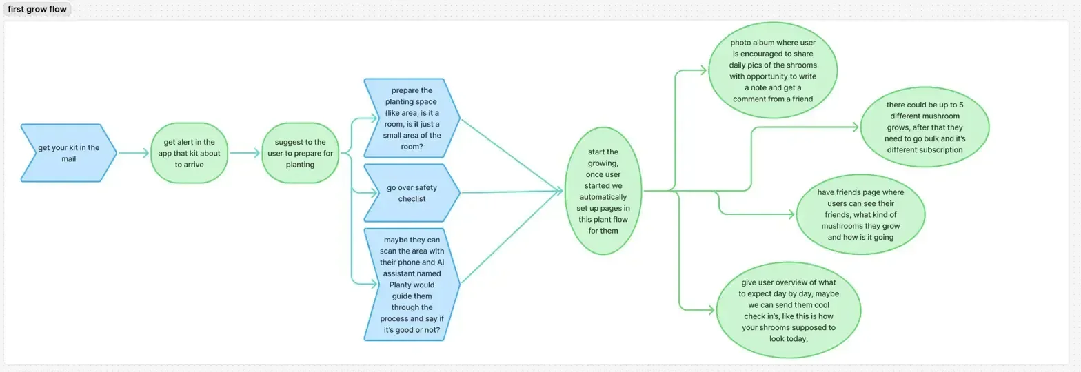
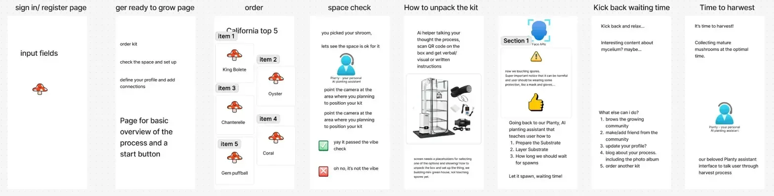
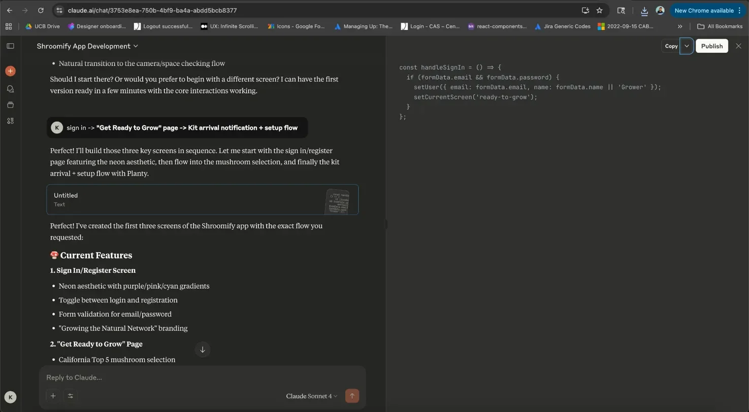
”So we are building the shroomify app, similar to what we did yesterday (great job btw), but now i'm going to give you branding and UI inspo, app architecture, first user flow i would like to create and lo-fi screens so you can have more solid guide how screens should look like.Pages: Sign in -> "Get Ready to Grow" page -> Kit arrival notification + setup flow
Implementation Approach: Progressive Web App style - Mobile-first with app-like interactions
Visual/Interaction Style: Interactive prototype - Working buttons, forms, navigation between screens”
Design artifacgts i created for experiment:

Claude Outcome:
Crashed 3 times and gave code with syntax errors. After some investigation I found out that a lot of semicolons are missing.
For those interested in code - Github

V0 Outcome:
Broke it all down in tasks for itself and got to work. When i got back with fresh coffee perfect glowing mushroom was waiting for me.
Design breakdown:
Appreciate the animation - header mushroom not only glows, it pulses too!
UI is cohesive with dark vibes branding, but missing requested colors - no cyan or fuchsia.
The typography is there too - nice touch.


Check it out for yourself! BTW love this feature, thanks V0!
Also design layer and inspection tool is a great addition, because who doesn’t want to go in a tweak a button specs in the pop up?
I thought by this point i’ll be writing conclusion, but literally could not sleep and had to see at least the UI Claude would come up. So had to run it all over again. And it delivered!
Claude recovery outcome:


Design breakdown:
UI and colors are more aligned with the branding provided. Buttons are bigger - instantly more app vibe.
The typography is not what was in branding.
Some odd interaction is happening with background attempt of animation that is a destruction from the screen itself.
It caught onto idea of Plany - the AI assistant from ideation screens in Figma - bonus points for extra effort.
The KH Creative Lens
Running Claude and V0 through Shroomify wasn’t just a gimmick—it was about testing how close these tools can get to real SaaS design needs. When you ground them with branding, flows, and lo-fi screens, you start to see their true colors: Claude codes like a backend dev trying to be a designer, while V0 leans into visuals and playfulness but struggles with consistency.
Neither tool yet understands the real work of design:
Respecting systems (spacing, typography, colors, and tokens).
Balancing function with delight (glowing mushrooms are cute, but cramped cards hurt usability).
Designing for humans, not just outputs (community features, service flows, AI guidance).
At KH Creative, that’s the missing layer we obsess over. Tools can generate components, but it takes design leadership to connect them to strategy, user needs, and service ecosystems.
Closing Thoughts
Both experiments were fun, but they also reveal a bigger truth: AI design tools today are either too code-heavy or too aesthetic-light. Claude gave me syntax errors when asked to build at scale. V0 gave me a glowing mushroom header, which is delightful—but delight without structure only gets you so far.
The future isn’t choosing between Claude or V0. The future is building AI design agents that can vibe with real product strategy, adapt to design systems, and co-create in ways that feel human. That’s where KH Creative plays: in the space between SaaS pragmatism and creative magic.
Because at the end of the day, I don’t just want syntax or mushrooms—I want a collaborator who can design services, not just screens.